Tuesday 2nd November – Colour Theory Notes
Monochromatic – Sticking to one base colour and closely following that colour for all of your design/
Complimentary – Opposite colours make them bounce off of eachother and make scene more lively but can be jarring EXAMPLE WES ANDERSON
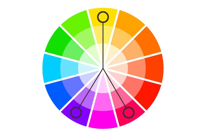
Split Complimentary – Colour scheme using one base colour and two secondary colours instead of using a complementary colour, two colours placed symmetrically around it on the colour wheel are used
Triadic – Too much of each colour and your desig appears to hae too many colours and can be too vibrant or noisy. To use a triadic harmony successfully, you need to be careful with how you use the opposite colours, and try to keep some of them to more of a tone than a true colour to soften the intensity.
CONTEXT – You need to consider how colours have been used previously, this includes branding, filmmaking etc.
Characters and Layout – Think about how the design and colour of your characters interacts with the foreground and background and even other characters.
Depth – You can use colour to create depth, objects further away should be less saturated.
TIPS AND TRICKS
Try working with a limited colour pallette
Think outside the box with colour
Don’t rely on black/white
Check your values, make an image greyscale in photoshop.
My Production Clip :
This is not complete due to personal reasons but I tried to get to a point of satisfaction before posting. I will finish and update this.
